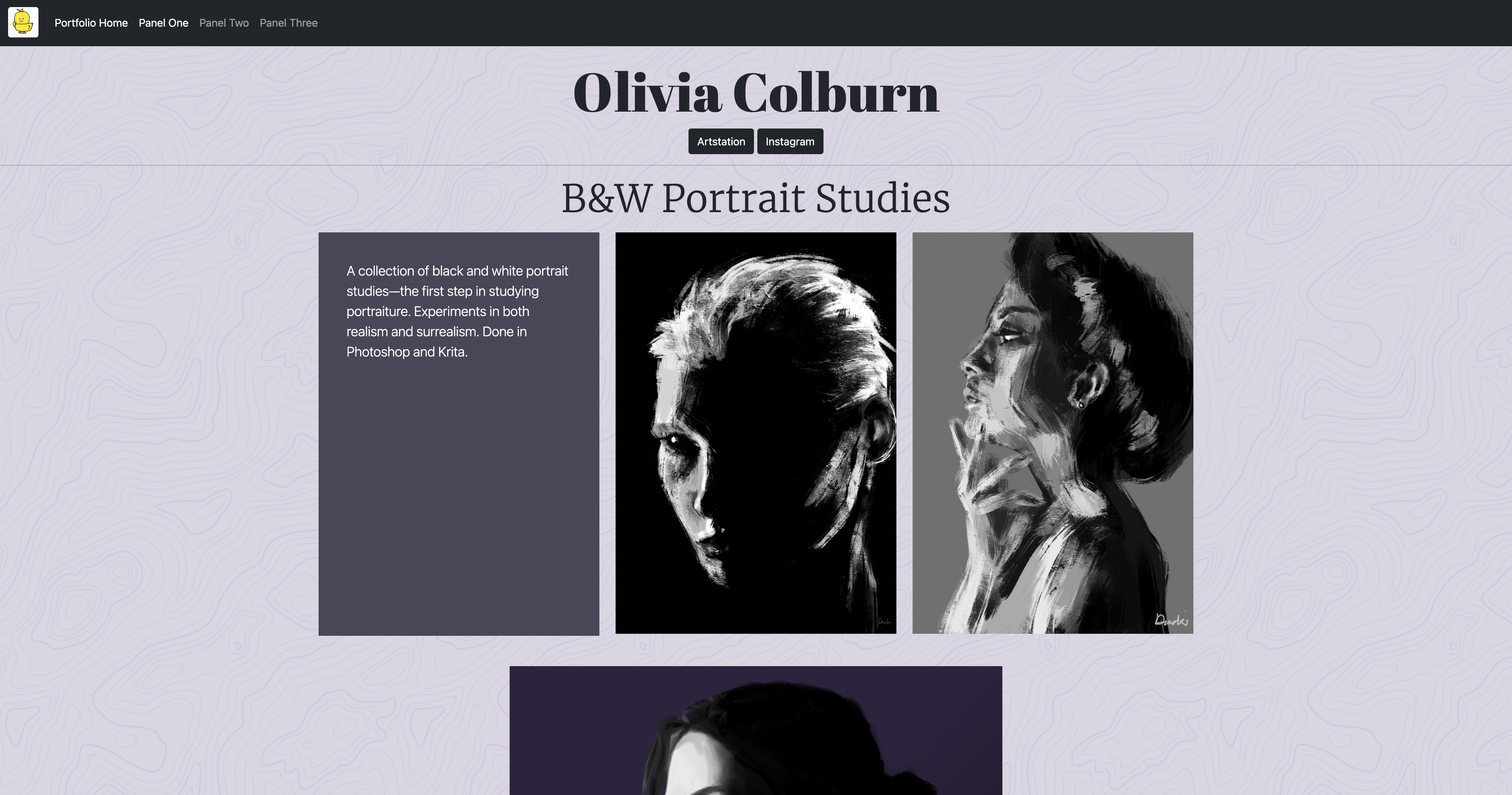
I'm surprised to say my favorite panel of the three was the first. I enjoyed working with the individual components of bootstrap rather than a template, and I think it came together well aesthetically. I used many carousels in panel one; the carousels I used have buttons that let the user switch between the images. I had trouble getting my carousels to work, but upon realizing that the first one was fine, I realized I had to adjust the IDs and ID references for each carousel and its buttons. I also toyed with cards but ended up not using them.
I think the most important skill I worked with was the bootstrap grid. I aligned most of the elements of panel one with it, utilizing offset and different size columns to make sure that all the content would be visible. I'm most proud of the design; I like the colors I picked, and the fonts work well together. In the future, I would be interested in doing more with cards; it just didn't work well for what I wanted in this panel. In this panel, bootstrap was my friend.
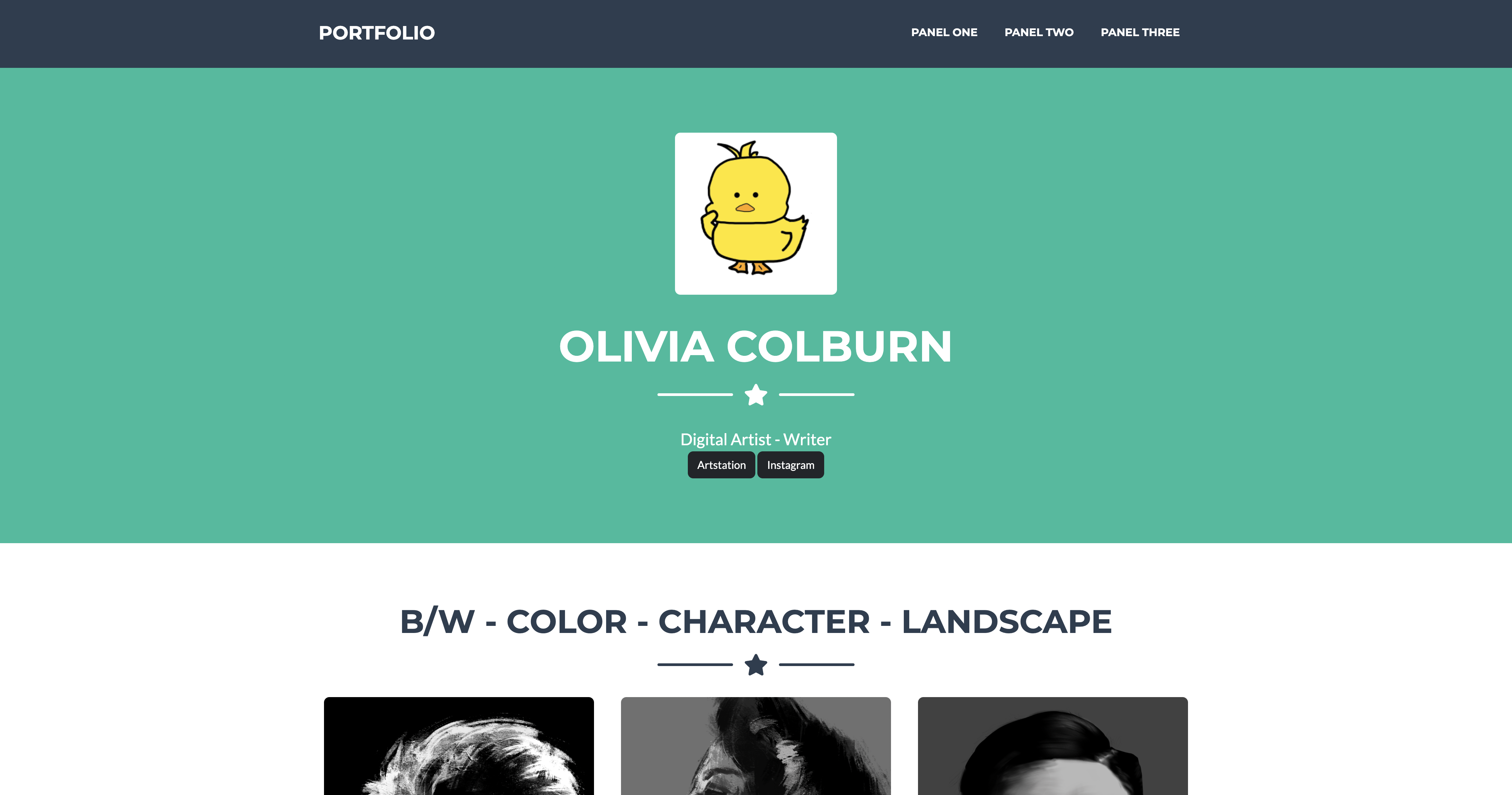
Panel two was my least favorite panel. I liked how the template worked; it was a simple portfolio with modals that would let the user view the image bigger, but I didn't really like how it looked. It was a little too bright and squishy for me. Overall, I think the template limited my content, since I used carousels that wouldn't fit well with the template. Learning to browse bootstrap templates was useful, but purely using the template is a pretty bland experience. In this panel, bootstrap was not my friend.
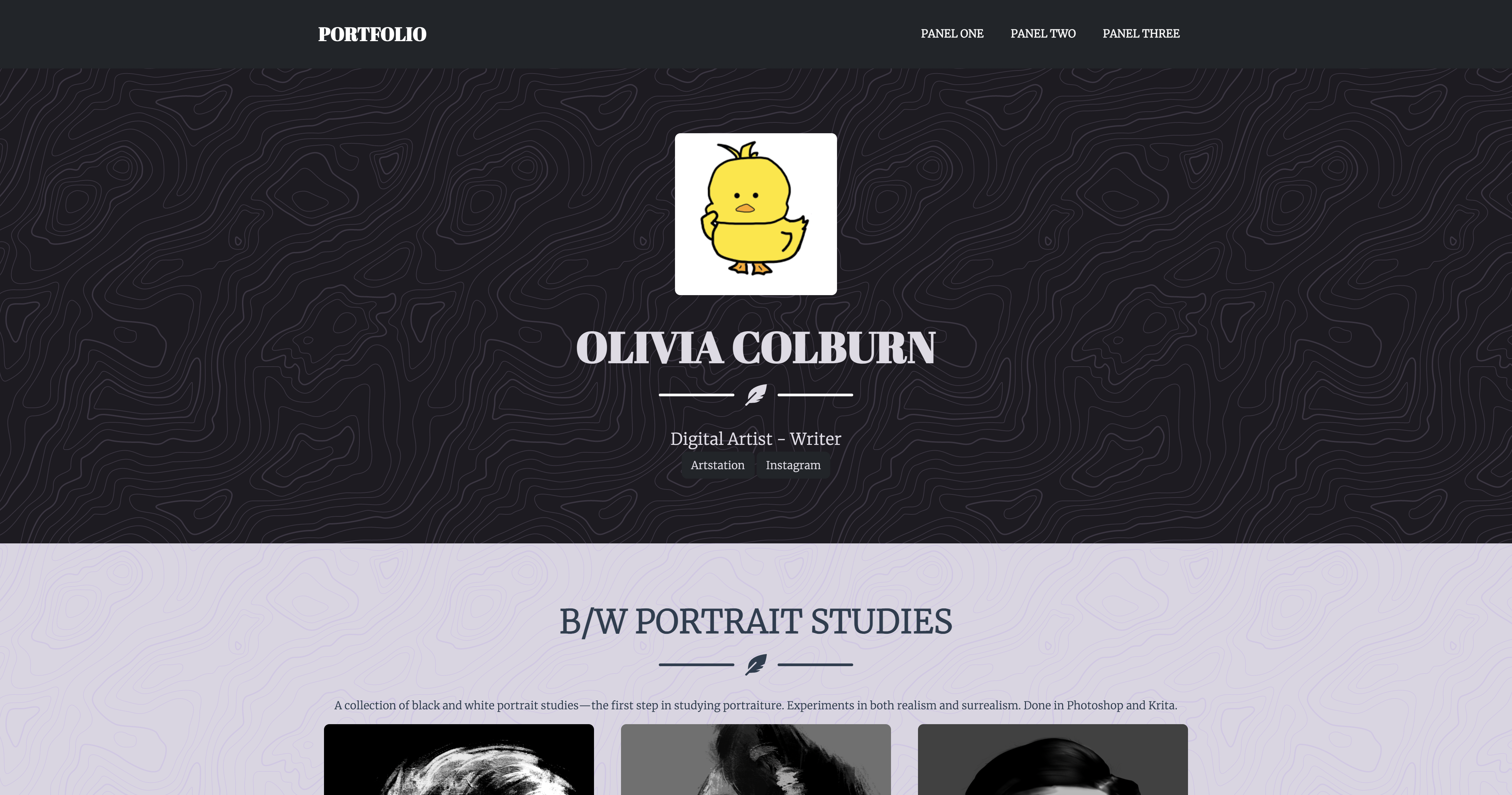
Panel three was a vast upgrade from panel two. I was able to change the colors and formatting to better fit what I wanted. Still, I found the template limiting and frustrating to use. Some things just didn't work for no reason, and other things were very long and annoying to deal with in the code editor. It was also a hassle to override style things rather than just starting with my own custom css. Admittedly, it has a lot more functionality than my custom bootstrap panel, but it loses functionality in other ways, like the carousels. Overall, I felt I had much more control in panel one and had to fix fewer things. It was more difficult to find and recolor different elements and text in panel three than in panel one. Still, I ended up happy with how it turned out. In the future, I would like to experiment more with adding different bootstrap components into the template, but with how many things I had to fix and edit just to get the base template working (and the simple portfolio worked well for my content, which was just a portfolio) it didn't feel warranted with this panel.
I was proud of the colors and font choices. They were mainly recycled from panel one, but I went further and changed the text colors to match the background colors, doing the same for the icons and dividers. There is very little pure white on the screen, making it easier on the eyes, but the text is still distinct from the background. Like with panel one, I think the overal aesthetics and color are the best aspects. I also like how I can show more of the portfolio, and the user can click on a specific piece to get a better view. In this panel, bootstrap tried to reconcile our friendship.